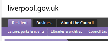
For all the focus on top tasks and the trimming down of content, I think the biggest change we made to the liverpool.gov.uk was the segmentation of service content from organisational information.

In other words creating the about the council section of the site – let us move a lot of ‘boring*’ stuff out of the way of giving people the information they actually came for.
It’s not really new, most commercial sites got this long ago – when was the last time you went to an online shopping site and had to read all about the companies’ long term business plan? or do you often go to amazon to read Jeff Bezos blog ?
[caption id=”attachment_118” align=”alignleft” width=”314” caption=”Tabs on HSBC's site (notice no about!)”]
It’s the public sector accountability thing that’s to blame J not that accountability is bad, but (in Liverpool at least) people are more interested in getting their rubbish collected.
We knew from the beginning that we couldn’t (and didn’t want to) remove all the documents about how the council is ran, not least because we are all council nerds too, but we realized we could put them in their own dedicated space just for them.
the freedom this gave in the resident’s section of the site to concentrate on service delivery was refreshing, and what allowed us write to the point content that tells people exactly what they want.
*boring is a subjective term, and we use it a bit flipiantly, the truth is we too are quite sad and think lots of it is intresting, sadly our users do not always agree with us.