Task focused development is a big deal for the public sector at the moment, but quite a few people have interpreted this as streamlined navigation, big icons, and less and simpler words. While all those things play a part in improving the experience. The thing that is often overlooked is the what the customer might actually need / want to achieve.
A example of where need can get forgotten in tasks is School Term times:
During your research and user surveys, you might find that School term times is a ‘top task’. Reacting to this you put schools and learning high up on your information architecture, and you rename your page from “school scheduled closure periods” to “Term times” so people know what it is.
Then you produce the page, and it’s a long list of dates or it’s a PDF. Well they are the term times and it is a top task, we’ve done it, haven’t we ?
If you actually look deeper however you will see that you have delivered the top task has but your users might also have a ‘top need’.
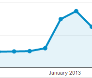
 Peak in visits to the term dates page around the start of …. term
There is no doubt people will be coming to your page for a full list of dates, but even a quick glance at your analytics will show you there are peaks and troughs in demand, especially around term start and end times. What many people will be coming to the page for is when does school start or when is half term over!
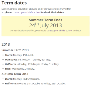
once you have identifed this need the solution is easy - on the term page for liverpool.gov.uk we pluck the key dates out of the core list and place them front and center.
The timetable is still there, but now the key next date is displayed and highlighted. No more looking around in the list or downloading of PDFs to get the date.
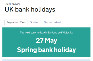
Other examples of meeting top need, is gov.uk’s bank holiday page,
Again clear simple right to the point. the Government Digital Service have a good write up on the impact this has made

