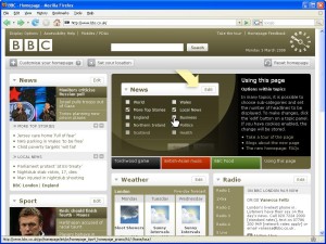
Ahhh, dashboards, portals and widgets, remember them? It was all the rage, not so long ago, to make your website super customisable, with drag and drop-ness and favourites and little titles saying, “Hello, Jeff.” Even the BBC were at it - their homepage, for a while, was a customising dream.
 Customise until you can find it no more.
With the BBC site you could add widgets for everything from weather, through radio station listings to a funky little version of the BBC clock, so you could tell the time (just in case you couldn’t see the clock on your desktop/wall/phone/wrist).
Ultimately, the BBC dropped the widgetised homepage, saying:
“…the majority of users haven’t taken advantage of [customization]. When customization features are highlighted, the perceived value is mixed; instead users tell us they place a higher value on being able to easily filter content, than re-order what’s already there.”
So, in the first step from customisation the BBC moved towards filtering content, but the latest version of the homepage looks to be doing away with most of the filtering, too. The reality is you can’t pass the job of content layout onto your users - they don’t usually want to invest that much time in finding out what is on your site.
LocalGov Widgeting
With the BBC doing it, lots of others were bound to be doing the same, and local government was no different. Widgetized homepages popped up all over the place. Some of them still exist today, but with the drive for the simplified, user-focused site, it’s very rare for a new local government site to have customised sections on it now.
Customisation doesn’t really work in local government, for the very good reason that the users just don’t care - and even if they did, they don’t visit the site often enough for it to particularly matter.
If you look at the profile of local gov website users, you will see that apart from one or two areas* most people are infrequent and single task visitors - they come when they have to, they do one thing, and then they leave. They don’t want to hang around and customise. They don’t want to create a local account. They just want to do the thing they have to do, and leave. This means that if you are building your site around user needs, it makes sense to provide quick access to the tasks people want, then let them do it - a method many councils are now successfully implementing.
*Often jobs, buses and leisure see lots of repeat visits.
Simple but the same… all the time
I do occasionally wonder, however, if the move towards the super streamlined site has taken us too far the other way. Sure, the homepage gives quick, easy access to things most people want, and it’s all about the new visitor, but could we help people that thing even more easily, if we knew something - even the smallest thing - about them?
There are a number of suggestions around how councils could still tweak their homepages including:
- There have been people who advocate of councils customising the homepage based on the time of day.
- While working with a number of council’s we have looked into delivering a different set of tasks on mobile sites vs desktop.
Both of these ideas have a lot of merit: you would assume that the audience for the site changes dependent on the time and place of the visitor. However, on the sites we have worked on, whenever we have looked at the data, we’ve not found a significant difference in the overall visitor profile - certainly, not enough to justify significant changes to the site layout.
What we have seen, is that when people do return to a site, even after some time, they tend to want to do the same thing as they did last time: check when the libraries open, report a problem with their bins, or check the council job pages.
Passive Personalisation
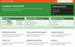
An idea we are working on for the latest version of the LocalGovStarterkit is personalisation of the site without the user having to make choices and pick where things go. Instead, they would be letting the site (ultimately, the content editors) make the personalisation choices for them, based on the information gathered on their previous visits.
At the back end, content editors will mark pages that can be personalised, and detail what form that personalisation will take (links, dynamic information, and so on). All the user does is visit the site, and when they come back they get a series of links and other information, based on what they did last time.
 Passive personalisation based on previous visits.
Passively personalising the site takes the cognitive load of personalisation from the user but still delivers a site that is customised to them, and what they are likely to want to do in the future.
This isn’t a new idea - many eCommerce sites do this to some degree. Amazon are forever pushing you things based on previous purchases. The difference here, is that instead of pushing all the things you might like to buy, we are presenting quicker ways to get to the things you have already done.
We are currently working on passive personalisation as a feature of the starter kit, you can see the code here, but the technology isn’t really the important thing here. Many content management systems offer some form of personalization. What’s important is thinking about ways in which you can improve the site for everyone, including the people who only visit once every few months.