It would seem now that web design is all about evidence: finding out how people behave, what they say they want and actually what they do, and then building ever more efficient ways of serving their needs (and getting them to part with their money). So, it is important that we understand the evidence, and don’t fall into the trap of reading into it only what we want to hear.
In the drive to gather as much information as possible on user behaviours, we grab onto any data we can - anything that takes user data and presents it to us in a clear and concise way is jumped on by everyone as a way to see how people behave.
Heat maps seem to tick lots of boxes. They amalgamate a lot of research into a single clear graphic that we can interpret to tell a story of how people use the web, but do they actually tell us what we need to know, or just what we want them to tell us?
Banner Blindness; or, no one reads sidebars?
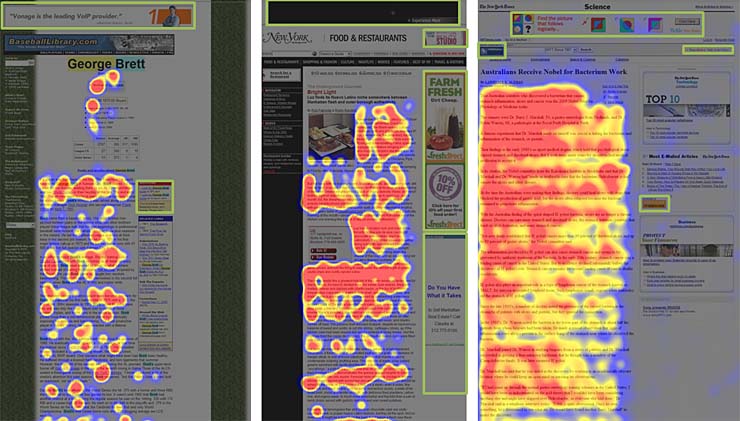 A classic and probably most used example of the use of heat maps to backup an argument, is the image above from Jakob Nielsen. It shows how users don’t look at advertising banners on websites, but, instead, focus on the content.
Looking at this image, you would say it’s clear that people don’t look at banner adverts - or, as was postulated at a recent conference, the sidebar is dead.
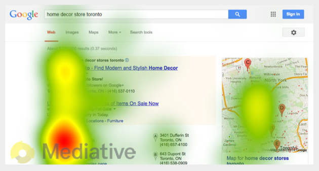
Except is that true? Because this more recent heat map from a study by Mediative seems to shows people do look at the sidebar.
Indeed, the accompanying article for the Jacob Neilsen image, says : “Several readers have asked whether banner blindness extends to search engine ads. It doesn’t: text ads on a SERP get a decent number of fixations”.
It is also worth pointing out that the Nielsen article was not talking about sidebars, but banner blindness. It’s just that most advertising banners appear on the right (there are more articles about how far right people read).
So is the right bad? Or is it adverts that are bad? Or should we all pack up and go do something else?
Well, the answer is probably a bit of of all of them:
Heat maps tell a story of large test volumes on specific sites. They imply some user behaviours (it would appear people can spot banner ads a mile away), but the reality is that heat maps are incredibly subjective, and the results depend enormously on the website being viewed by the users. Heat maps don’t confirm any understanding or success on the user’s part, they just tell you where they are looking.
There is much more value in testing your own site, and testing it with a few users to see if they are finding what they need, then there is in looking at heat maps of other people’s sites. I once sat in on a user testing session, with eye tracking, and watched the user look directly at the link while saying out loud to the facilitator “I can’t find it”.
We see what we want to believe. Just like a good politician can always twist government statistics, we can always do a quick search of the internet to find an image somewhere that backs up our existing world view. If we really want to understand users, and get the best out of our site, we need to spread our research wider than Google search, because as UX Myths Myth 0 states:
If you read lists like this one, you don’t need to do research.