It’s not so much an emerging trend, as an evolving religion: simpler, cleaner, faster is driving almost all digital development in the public sector, and whilst this is a good thing, like everything else, you can have too much of it.
If you are staring with a long established ‘traditional’ service or website, the stripping back process is easy to begin with, the 8 different ways to navigate on one page, or the reams of information about your chair stacking policy can start to fall by the wayside with little or no detrimental effect on how successful users are at achieving their goals on your site.
But get over-excited with your simplification and you can end up making the whole thing worst than when you started. The skill in stripping back to make simpler, cleaner, faster services is knowing when you have reached the right point, and then stopping.
Example: hiding things behind a button because the page looks simpler.
There has been a lot of research into how we remember and retrieve information, and people will often cite that the human brain can only hold 6-7 pieces of information at any one time, but when we are talking about digital services there are a few problems with this:
Firstly, it’s wrong: it’s old research, dating from 1956, and it focused on the capacity of our memory as a concept, but nowadays we think it’s more complicated and fluid than that. It may actually be more accurate - but still wildly over-simplistic - to say we can hold just three or four things in working memory at one time.
Secondly, and much more relevantly to us, those studies are looking at memory storage and recall: this is how our brain works when we have to remember lists or items. It is not how our brain works when we are scanning information to find things. That, it turns out, is completely different.
Research into how we scan and make choices actually shows that we can cope with much larger collections of information. We are not asking the user to memorise all the options, rather to read, reject and move on, until they find the option they are looking for. There is more research into the details of how the lists are presented, and the best way for the brain to scan, but the overarching truth is that when navigating websites we can cope with much more information than the 4-7 things we’ve been assuming.
So, “simplifying” a site until it has only 6-7 visible choices isn’t necessarily making the site any simpler for the user. Hiding navigation behind buttons, to only display the full list isn’t advantageous, it just provides one more level of mystery meat navigation where the user doesn’t know if what they are looking for is behind the button or not.


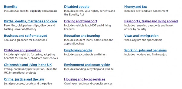
All of these ‘more services’ buttons hide the navigation from the user, and in some cases they only extend the list from 6-7 items to 9-10. So, it wouldn’t exactly be information overload to display the lot, but the decision not to is just hiding useful navigation from the user. It can also have knock on effects: forward and back navigation gets harder, if returning to the page makes that extended list collapse again. A genuinely simpler way would be to list the services in a way the user can scan and find what they are looking for.

This list allows the user to quickly scan the options and find the area they are looking for without having to click on extra buttons. Notice how the titles are nicely lined up, to facilitate ease of scanning, whether the user prefers to read across the rows, or down the columns. This is the sort of thing that makes a bigger difference than we sometimes realise.
So, as with everything you can have too much of a good thing. If you over simplify your site, you risk making it harder for people to find what they are looking for.