[this post forms part of a series discussing the liverpool.gov.uk website project]
I have talked about navigation before (part1) (part2), and i suppose this post forms the never written part3 to that series.
- in part one - i discussed all the navigation features we had built and how they were designed to help users find information around the site.
- in part two - i discussed the evidence we had gathered about how the navigational elements where used.
- now with the new liverpool.gov.uk live i can talk you though what decisions we made based on that evidence.
Less is Less
[gallery columns=”2” ids=”610,598”]
The first thing you notice when you look at the new site vs the old is how much has gone, we have lost the mega menu and the left hand navigation from pages. This has helped us to reduce the clutter on the site. We felt that we were subjecting the users to the tyranny of choice, with too many ways to achieve a task it was causing confusion rather than clarity.
We looked at user behavior and saw that people were generally not switching between tasks on the site - so providing a full menu to someone looking to get their bin dates was offering no value and only cluttering up their view of the information they wanted.
Section Tabs
So the new site had very little site navigation - we have kept the tabs, because they represent the large context switches between the service, business and organisational elements of the site, and while users might not habitually change between these three sections, we felt it was important to maintain the distinction between them for the users so they know just what type of information they are looking at.
Related pages
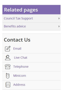
in removing the traditional left hand navigation from the site, we removed all methods of getting between pages in a section, but what we have done is pay more attention to the related pages section, making in effect a hand built navigation that can reflect the task the page is relating to. this is often necessary when a task may cut across two different areas (council tax & benefits for example).
Building the related pages manually gives us a greater flexibility but does come at a cost to of maintaining the links for our content team. this is why for the large council section of the site we have built an ‘auto’ relate section which acts much like traditional navigation listing files in the section.
Contact Us
We’ve kept the contact us block, as this has proven invaluable in helping us to track customer contact throughout the site. by separating contact numbers and email addresses from the content we can track when people choose to contact us via another method and from what pages on the site, this gives us great insight into what to improve and where.
A-Z
If I’m honest I don’t know why we still have an A-Z, it’s probably more for aesthetic reasons than functional ones. while the site is build for external customers, we know our own call center use the A-Z and removing it would be more pain then it took to implement.
Navigation where needed
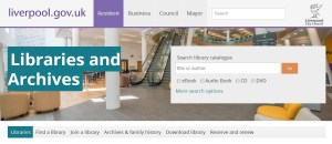
Having cleaned the site, we have delivered something that is very much geared toward people who come to do one thing, do it and leave. but their are a few places where that is not the behavior of our users. the most notable areas are lifestyles (gyms) and libraries. here users often browse between pages within the section, either looking for what’s on offer or just exploring the services.
For both of these areas we have build a navigation bar. this allows these areas of the site to have some consistent navigation and their own look and feel while still fitting within the wider corporate site.
Cleaner, easier
Having removed and rationalized the navigation on the site. The results are a cleaner and easier to follow site - one of our core values when building the site was to “give people what they want quickly, and easily and not get in their way” and everything we have done has been in line with that..


