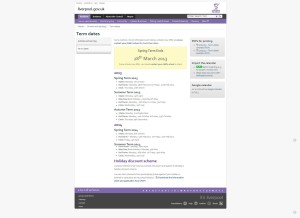
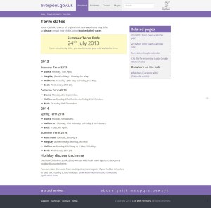
So we are very very near the end of the migration of liverpool.gov.uk to umbraco. you can see it now @ http://beta.liverpool.gov.uk/
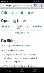
Along the way we’ve made some ‘minor’ improvements. simplifying some of the site navigation and improving the responsiveness of the site on different devices.
Mobile
Since we first launched the new look site in 2011, we’ve seen a massive shift towards mobile, and while we feel liverpool.gov.uk is one of hte best local goverment websites on a mobile, we wanted to improve that.
Navigation
A big area we looked at improving was navigation, the existing site had lots of different ways to help users around, from drop down mega menus, side navigation and breadcrumbs. we’ve looked closely at this part of the site, and after much research have come to the conclusion we had to much. so the new site, has very little - as much as we loved the drop down menus no one was using them, and they added to the visual clutter of the site.
Icons
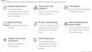
we like our icons and they are increasingly in use across local government but again since 2011 things have improved and for the new site we’ve moved to a font based icon set - this has a number of advantages, including reduced file size and better scalability - so bar the photos on news, libraries and lifestyles, we have no images on the site.
The only real downside with using the fonts, is Google Chrome’s currently very poor rendering on Windows. this is apparently being fixed in an upcoming release and then the site will look as good in chrome will look as good as it does in IE10!
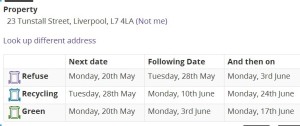
Address Lookups
we’ve also been looking at how we address addresses on the site, it’s not a precise science but we are trying to get more consistent with the way we ask people where they live, we are also remembering when they tell us, so we can use it across all areas of the site. this is only the first step, we are looking to rapidly expand this part of the site, so we can offer more personalization.
Imagery
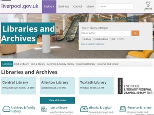
we’ve added pictures to the site! - now while that might seem fly in the face of the whole simple top tasks methodology - we’ve actually added them in places where a top tasks is ‘to see what it looks like’
A really good example of this is the Cities new multi-million pound library that opens on friday, people will be coming to that page for one of two reasons, to see if it’s open and to see what it looks like.
We’ve also added pictures to parts of the site where people are more likely to be browsing, so parks, libraries and lifestyles centers, but all the time we’ve been mindful not to get in the way of the tasks.
Umbraco
And finally (for now) we’ve migrated from Tridion to umbraco. the simplification of our site and content management model together with our development approach has made umbraco a much more suitable choice for us. there are many many things we’ve done with umbraco to build the site - they will no doubt be subject to many posts - but Marc our cms development lead on the project has done a lot of that already.
Lots more
and there are lots and lots of little tweaks around the site, I’m hopefully going to explore them more over the next few weeks. but for now, we just have to get all the last minute snags out the way, and get it live. should be a fun day. : )
