As part of a very occasional series, I did a presentation on Trends in Local Government Websites at the SOCITM Better Connected Live event, yesterday. It would seem that I am the only one sad enough to be tracking the changes in local government websites every month, in quite the depth that I do.
I’ve put the presentation online for you to peruse, but I like to think that it made more sense with my words over it than the images do alone.
PageSpeedy
PageSpeedy is really not much more than collection of python scripts that I wrote a while back, which go off to other people’s APIs and code, to try to give a picture of how local government websites are doing, especially when it comes to page speed.
The speed of sites is something that, I think, people all too often forget about. Sitting in the council offices with the high speed internet connection can give you a false sense of how good or bad the internet speeds are for people in your area. If your site is slow and your users are on the wrong side of the hill, then no amount of streamlined, user-focused design is going to save them from a terrible experience.
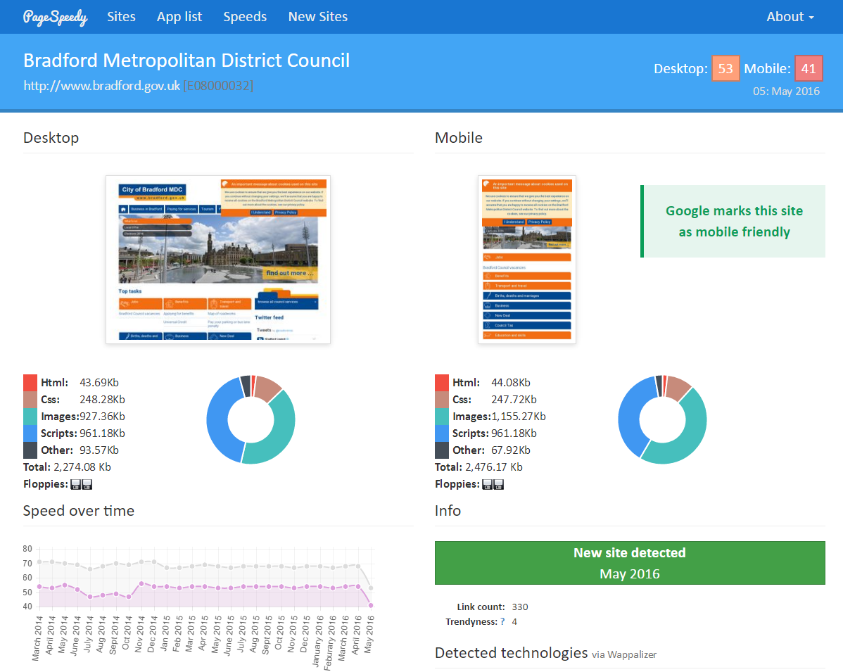
Almost as an afterthought, the other thing PageSpeedy does is to collect screenshots of each site it checks. As it runs monthly, this means we have a snapshot of each local government website over time, and we can see when changes are made. Now, I would like to say that there is some clever and complex algorithm looking for changes between sites each month, but I’m afraid there really isn’t. By far the most effective and quickest way I have found to check for changes, is to look at them. The human brain is really attuned to noticing change, so it doesn’t take that long for me to compare the screenshots each month, with the month before.
New Sites
Alongside the speed tables (and who doesn’t like a league table?) we publish a list of new sites each month. This means we get to see what is changing, and it gives me the opportunity to talk about trends.
Trends
When I talk about the trends in localgov sites, all I am really doing is giving a high level view of how homepages, navigation and content pages are changing. I am not doing full-on task and user journey stuff, because, well, I am not doing a full review of 400+ sites every month. Not for free, anyway - contrary to appearances, I do, in fact, have better ways to fill my day. But, the high-level trends are pretty interesting on their own, so here are a few things I have noticed:
Icons vs Text
Most sites fall into one of two camps: icons, or text. Icon sites have icons to guide people to what they need to see, while text sites give people headings and lists to navigate around. While both approaches can work well you have to be careful of the pitfalls of these.
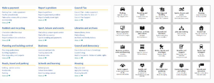
For icon-heavy sites, if you make the icons too big, you can end up triggering “icon blindness” - and remember, before you commit to icons being a big part of your site, you have 600+ services - are you confident you can find a meaningful icon for them all?
Going with text-only navigation isn’t without its pitfalls, either, though. It is very easy to present too much information, and have the meaningful and important get crowded out by the generic.
Simpler Nav
Alongside the improved layouts many sites are changing the way they handle navigation. For the old school localgov site, navigation would be coupled with some form of description and, if you were really unlucky, a page or two about the council’s policies.
Most new sites now recognise that all people really want to do is get to the information, so they are providing clear and quick navigation that doesn’t try to do more than one job, and just points to the things you want.
More More More….
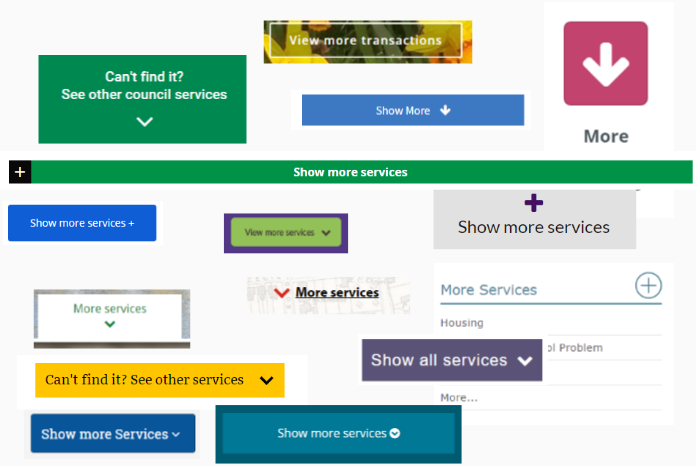
With so much information to present, it’s quite tempting to split off the popular or important information from the rest, and simplify the site by hiding everything behind “More”. I’ve written about this is the past, but the summary is - it’s just confusing and hides what people are looking for.
Content
Finally: while I am generally looking at navigation and basic design features when browsing new sites, it’s hard not to notice that the content is often wanting, even on new sites.
The reality is, the design and navigation for most localgov sites have been improved massively, but we still have lots of poor and legacy content. Make sure your site isn’t telling us important things like “Under 4s are children aged 0-3” and the complete history of wasps, only to forget to mention that the council no longer deals with wasps.

By working out what content is relevant and important, you can start to rationalize just what your stretched content team can concentrate on. The content is a crucially important part of the site, and by addressing it, we can improve not only how the homepage works, but also the user journeys people actually undertake.