- Review Date: 16th August 2016. (Page Speedy Report)
Site : http://www.elmbridge.gov.uk
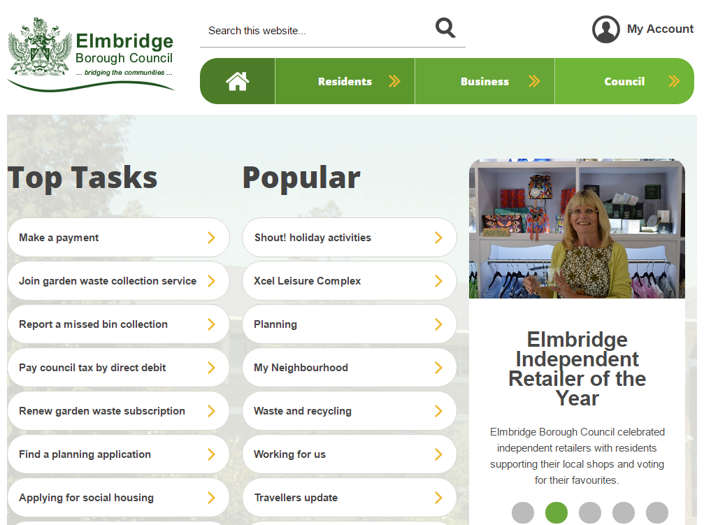
The Elmbridge homepage is dominated by the Top Tasks and Popular sections, giving users a list of things they can do. Whilst a task-focussed approach is always an advantage to the user, the risk here is that people probably don’t know that the thing they are doing is “popular” or a “top task”. They don’t know what other users generally want - they don’t have access to your logs, and they have no way of judging how normal their request might be. Also, offering both furthers the confusion - aren’t top tasks also popular? How can I decide if my task is more “popular” than “top”?
The Popular section also mixes a lot of concepts - it appears to contain news, task, navigation and event information in a confusing mix, making it hard for users to understand which option will meet their need.
On the plus side, most of the tasks are labeled with actions, allowing people to see what they can do with them, which will definitely help people.
Navigation / Structure
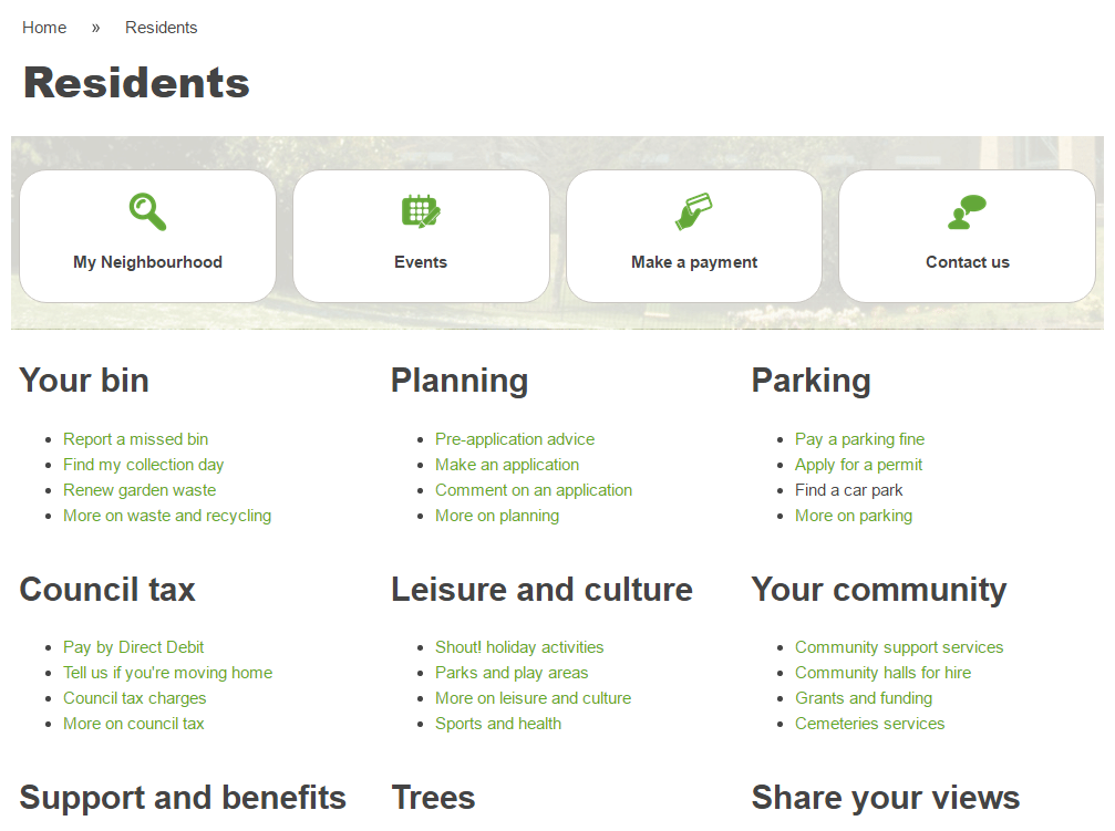
The main navigation of the site is segmented into the now common Resident/Business/Council sections. Underneath each section, the navigation pages are clean, if a little sparse. They also provide space across the top for the tasks within a section to be highlighted, which I liked. It’s a good way to surface the most used tasks to the user quickly and efficiently, although the interpretation of this idea is a little confused from time to time - labels like ‘My Neighbourhood’ don’t really offer a clear idea of what might lie beneath.
 Residents navigation with highlighted tasks
Tasks
We’re not doing in-depth usability testing on sites (though if you’d like us to, do get in touch!) but we’ve had a quick go at achieving some common, often high-volume, user tasks.
Recycling
Finding a collection day isn’t really a distinct task on this site. Instead, it leads to a gateway into the My Neighbourhood feature, which is a sort of dashboard of things about where you live. The appeal of this approach lies in the way it simplifies the process of managing and presenting this information, but it’s not much of an advantage to the end user. It’s confusing and sometimes overwhelming to be presented with a range of irrelevant neighbourhood information - much better to answer the question (e.g. your bins will be collected next Thursday), and offer links to further information, than to bombard with unsolicited information on planning, councillors and weather forecasts!
Libraries / Leisure
Elmbridge, being a district council, doesn’t directly provide library services, but since the public may not realise this organisational subtlety, it’s useful for all councils to offer the information. In this case, a link out to Surrey council is hard to find (it’s in the A-Z). Leisure services do exist, and some information is on the council site. More detailed information is held on the website of the leisure trust, Places for People Leisure, and the council site does link directly to the relevant location on the external site. That doesn’t sound like much, but actually, very few council sites manage that level of information integration!
Contacting the Council
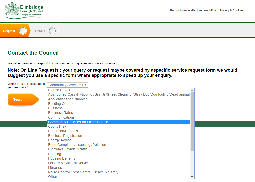
While the utopian hope of many a web manager is to completely remove direct contact with the council, it is inevitable that it will sometimes be necessary for the council to deal with the public on an individual basis. Elmbridge have tried to funnel all contact through Achieve Forms, and in doing so have created quite a complex process.
 The contact form is quite cumbersome and resets the user journey.
No doubt they are getting some great statistical information about service contact and the nature of the issues faced, but it makes it quite difficult for the user to get hold of a phone number or email. I know, that was the whole point, and in these straitened times, it’s always wise to guide users towards the cheaper methods of contact, but if there is simply no way of getting to a real person with a complex problem, users will be driven to looking up the number in other ways, and will avoid the council site all together.
Summary
A clear and simple site, let down a little by the overuse of “Popular” and “Top Tasks”. The effect is to create a disjointed and sometimes confusing navigational structure. More integration between county and borough services would certainly benefit the users of the site, but they’re already doing much better than many with this.
