- Review Date: 19th August 2016 (Speedy report page)
URL: https://www.midlothian.gov.uk/
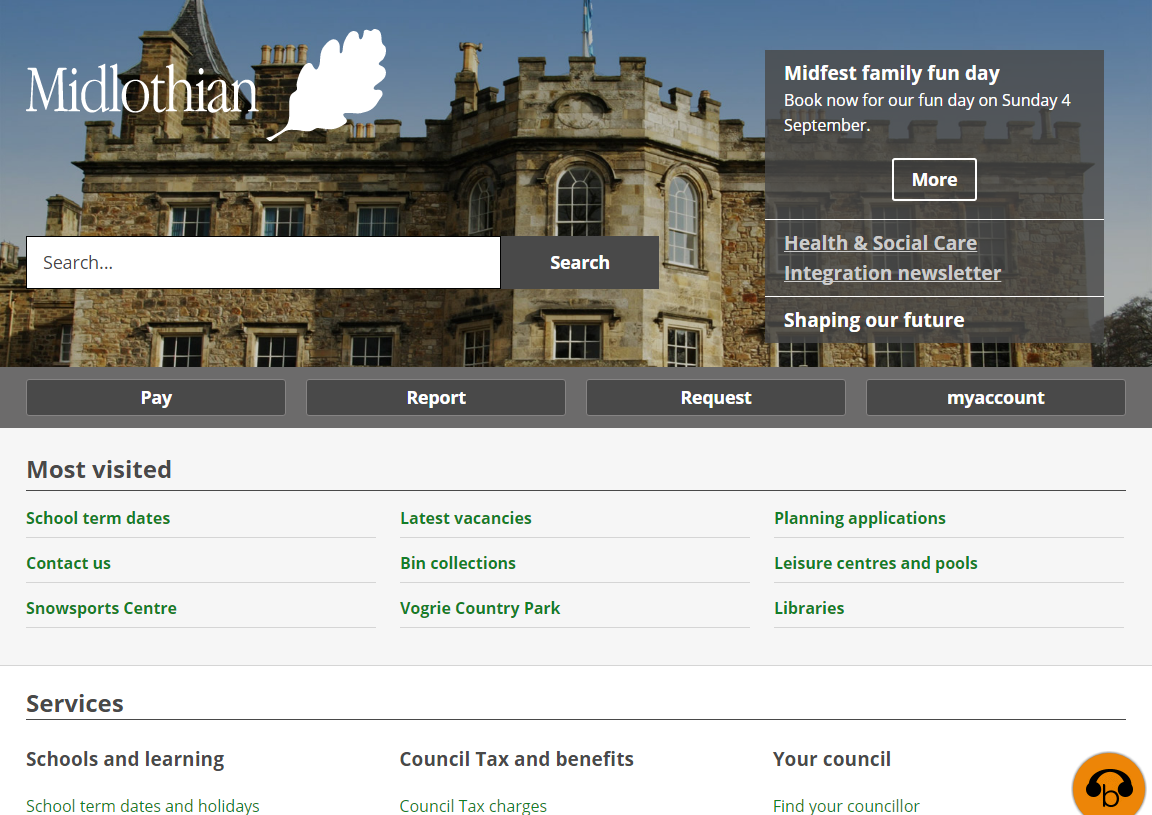
Search dominates the homepage for the Midlothian site. There are differing views on “big search” homepages. It does offer people a clear way to find things on the site, but there’s a good chance that people who were likely to search for what they wanted, already have - and Google sent them to the right page first time, so they will never get to see your homepage, with its lovely big search box.
The rest of the homepage is clean and well-structured, providing links to tasks and services in a way that is easy to scan.
Navigation / Structure
Across the site, the navigation/gateway pages provide nice clear access to the content beneath them. The use of a “Popular” section at the top allows for quick access to the most likely tasks that people will want - though we’ve talked before about the word, and how users can’t know if their own task is a “top”, “common” or “popular” one.
The site is structured in a clear and consistent manner. The separation of leisure and libraries gives the user a clear direction to go in, when looking for these services. By providing three links beneath each of the main sections, the site offers the user the ability to get to the content they need, without overwhelming them with hundreds of links on the page.
Tasks
Rubbish
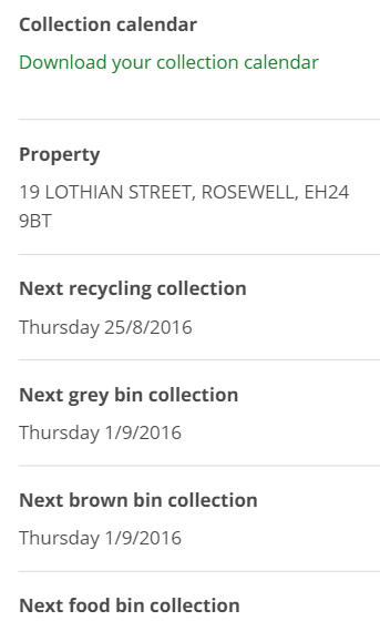
Finding collection dates is easy and straightforward on this site. The information has been cleanly integrated, and the principle of presenting the user with the information they asked for first is used well - details of the next collections are shown on the page, with a link to more detail offered in the form of a calendar download.
 Bin collection information is clear concise
In general, the content around Bins and Recycling is written in a coherent and concise manner. Users get the information they want, without getting side-tracked with council speak.
Libraries and Leisure
Unlike in many councils, the Libraries and Leisure information forms part of the main council site, and this makes for a much more streamlined and unified experience for the user.
For venues, the obvious information, such as opening times and location, are clearly presented. There is very little “waffle” on this site, but there is still enough information to get things done.
Summary
The Midlothian site is well-structured and well-designed, offering clean and clear navigation to users. It is refreshing to see that the content has also been given a lot of thought, and the result is real clarity in the information given to people as they work through the site.
The site is a good example of design and content working well together. The design offers clean and clear navigation, and the content is concise and gets the point quickly.
Forms integration is also well done, the forms feel like they are part of the site, and they fit logically within tasks.
