- Review Date: 18th Aug 2016 (Speedy report page)
URL: http://www.hastings.gov.uk
In general, the Hastings site suffers from trying to fit too much information into a confined space, resulting in some compromised design features, and a generally confusing homepage layout.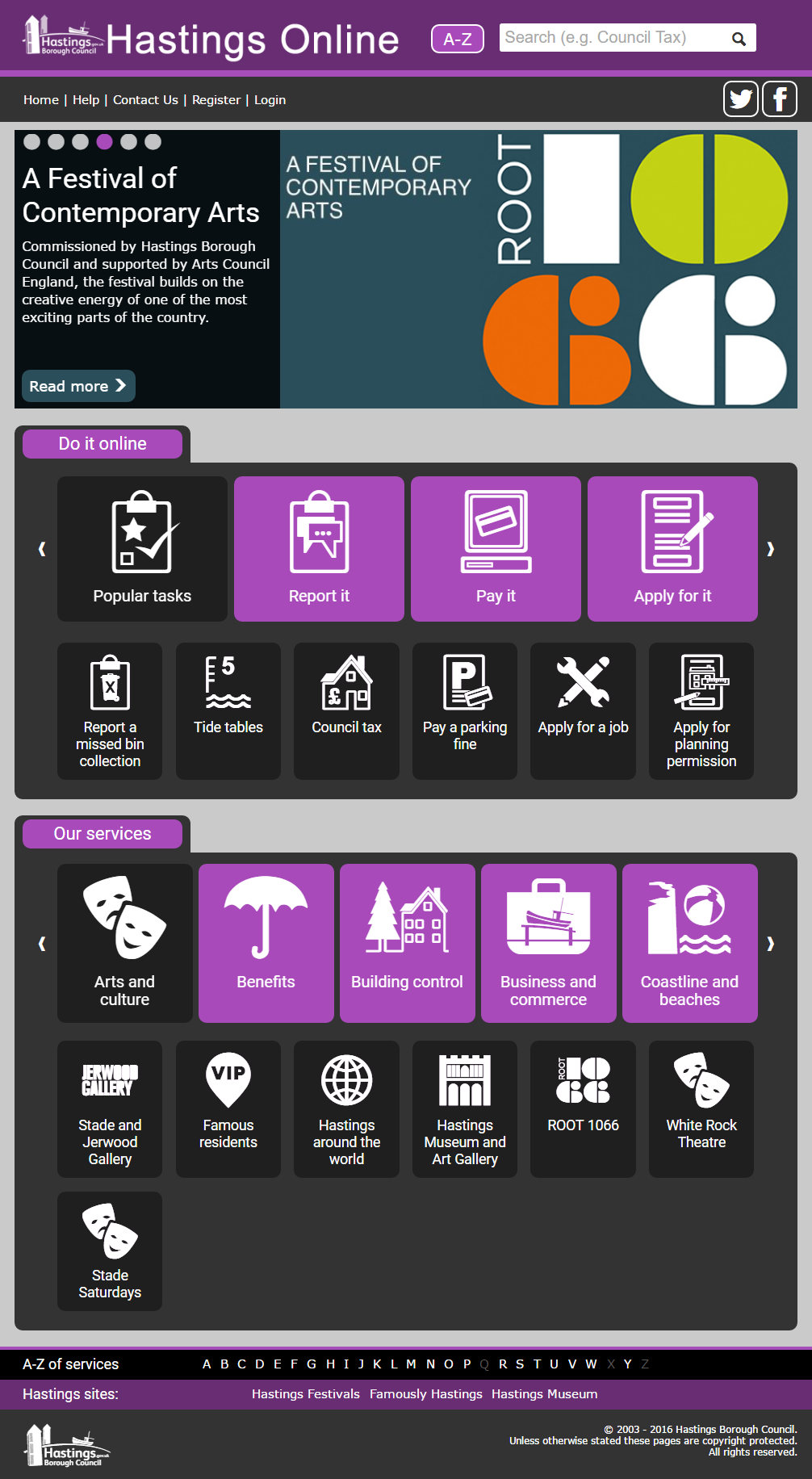 Hastings homepages, dominated by news, and a heavy reliance of carousels.
The use of carousels has many down sides for users, and unfortunately the Hastings site has a number of them on the homepage. As a result, there are multiple “mystery meat” navigational elements, where the users can have no idea what lies behind a button. By clicking one button over and over again, the user gains a slow, progressive disclosure of what the site contains, which makes it almost impossible to scan content, and gain a general understanding of what is where.
In one place on the homepage, the design clings to the idea of the carousel, even where it is clearly unnecessary - it displays four elements at a time, hiding only one from the user, even though the next carousel on the page displays five at a time (out of 28). A carousel for its own sake, when we know that they are unhelpful to the user, seems like a particularly odd design decision.
Navigation and structure
The majority of site navigation has been squeezed onto the homepage, so it’s often very cramped and difficult for the user to see what is going on. This is also hampered by a very wide and flat navigational structure- there appear to be as many as 28 top-level service elements. Presenting them in groups of five makes it a slow and laborious task to find the page you need.
Tasks
We’re not doing in-depth usability testing on sites (though if you’d like us to, do get in touch!) but we’ve had a quick go at achieving some common, often high-volume, user tasks.
Rubbish
Finding your collection day takes you to another site, which is considerably slower than the council site, and appears to be shared by a number of councils (Also, during our tests this site became unavailable). When you get to it the collection day lookup is simple and easy to use, but would still be better if it was integrated with the council site.
Reporting Tasks
All online reporting/forms activity for the Hastings site is directed through the My Hastings portal, which aggressively pushed users towards creating an online account even when reporting the most simple of issues. It is not at all clear what, if any, benefit this account gives to the users, but its requirement does add several additional steps to the process of reporting a broken street light, for example.
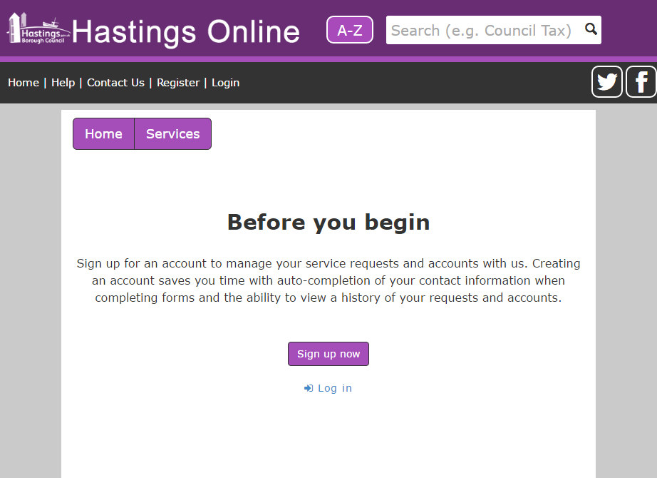 Submitting reports to the council, pushes you towards creating an account, often with no other way to proceed.
Summary
Overall, the Hastings site is let down by trying to cram almost all the features of the site onto the homepage, and prioritizing the organisational needs over those of the user. Pushing news before services, and online accounts where users want to perform simple tasks, all add up to make the user’s experience more difficult and time consuming than it should be.