So here we are, shiny new blog site. Yes I wrote the theme myself (developer you see*), and yes it’s a bit sparse but there is a reason for that.
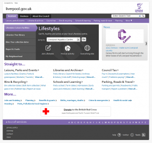
[caption id=”attachment_43” align=”alignright” width=”300” caption=”the new liverpool.gov.uk”]
I’ve spent the best part of the last 12 months looking usage statistics, usability research, and behavioural research. Just to try and get an idea of how and why people visit websites, specifically liverpool.gov.uk.
Now this website is no liverpool.gov.uk for one that site gets over 4 million visits a year, this one will probably get 4. That site had proper designers, developers and content managers working on it – this one has me. but looking at that site, how it works and what people want from it, has lead me to change the way I think about websites quite a bit, and indeed when I was knocking this blog together it probably had quite a influence on what I did.
The big message we have been pushing to the council about their website for the past 12 months is “no one really cares”. Yes it’s nice and maybe important that you’ve just cleaned up the old English garden in the park, but the majority of people visiting the site just want to know when the swimming pool is open and get on with their day
It’s been very challenging bringing that type of message to a lot of people. Every step of the way we’ve backed what we’ve said up with evidence, and that has helped a lot.
We did a customer survey and asked people what they wanted – they wanted to find jobs, we looked at the stats and what people looked at on the site – they looked for jobs, and we looked at what people phoned up and visited the council for, that was mainly bins, but that’s because all the jobs are only on the website. Jobs was a big one, but as there really are none, we concentrated on the next things on the list, and that was lesiure centers, libraries and bins.
The underling message was always the same though; the user almost always came to do one thing and then leave. That means when they either arrive at the homepage of the site (a decreasing number do) or on some other page from a google search, they just want to find the thing/get the information/fill in the form and go. That being the case best we can do is get as far out of the way as possible, and that’s how we ended up with the liverpool.gov.uk you can see now.
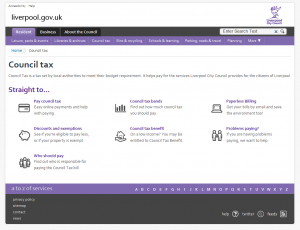
[caption id=”attachment_41” align=”alignright” width=”300” caption=”Just the links you need nothing more.”]
Some people say that that site is a bit bare, but when you look at it, or indeed test it (as we of course did) what you actually see is a site that gives loads of information out with giving to much and scaring people away. There’s loads of theory in there about chunking), paths of least resistance and we had a good discussion one day about the scent the bins gave off. After all of that you actually get a site that does it’s job and gets out of the way. Something we think the site is doing well.
So, how does that relate to this ….. Well almost blank site? Quite a few ways really; the main one being the lack of other stuff to get in the way. I though about this for a bit – because I wasn’t about to research it – but I have a strong suspicion that when people visit a blog, they do it to read the post, they don’t really do it to see the pictures in the side bar, or your twitter status, or indeed the popular comments by other people, they come to read the post.
That’s why I’ve taken everything away, and just built myself a blog, that shows posts, and erm… 3 pages. The idea is all the other stuff won’t get in the way of you reading my wonderful prose (you are surely still not here?)
And the reason it doesn’t go right across the page? That’s easy, because the lines would be too long to read. Studies show (don’t they always?) that a measure (line-length) of between 50-80 characters is easier to read and long lines of text are harder to read and comprehend.
So there you go, no extras, plus readable line lengths = blank blog.
*once a developer, always a developer: other people’s themes = not invented here.