In the previous post I outlined all the elements of navigation on liverpool.gov.uk. In this post, I am going to ask the question, why is it all there and is it serving any useful purpose?
Evidence, Evidence, Evidence
When we developed liverpool.gov.uk we gathered evidence for everything we do, through web analytics, surveys, call data, user testing and existing research, and since the site was launched we have continued to look at the evidence to see how we can continually improve the site. So, let’s look at some evidence for navigation on the site.
In and out
As I said in the last post, when we looked at the visitor profile of our external site users, people don’t continually come back to the site. They visit no more than once every few months, do a single task and leave. So we built the site to aid the first time visitor to do a single task - up front and centre, the most popular tasks first.
Landing Pages
Landing pages are heavily used, and they make up a large proportion of the popular pages on the site. When we look at the analytics, people do use the links on the pages to get to their destination. They have little choice, if we’re honest - these pages are nothing but navigation.
 Landing Page signposts with click-thoughs
We continually look at the stats for these pages and we balance the usage, so the most popular link should be first, and less popular ones are pushed down - even into the “More” section, if they are hardly used. We’re aiming to keep the pages clean for the majority of users.
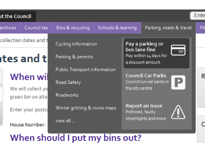
Mega-Menus
We all love mega-menus. They are the things that pop down and show you loads of links - it’s a way of cramming lots more menu into your page without throwing hundreds of links at your users. So, do users like it?
When we did user testing, people who used the menu did like it. They found it an easy and quick way to find the tasks.
Analytics, however, show that the mega-menu is only used in 1% of the time - and then 80% of people use the standard navigation list and 20% use the tasks and icons - (that’s 0.02% use the tasks bit of the mega-menu)
Sections
I’ve said previously that the segmentation of the site was one of the best things we did - and people do use the sections. The “Council” section of the site gets 4% of site traffic. When you look at the click-through to these sections from the homepage, the numbers are similar.
However, when you drill down into any section of the site, the click-through-rate to different sections of the site drops significantly. For example on the schools section of the site, only 1% of people click on “About the Council” and it’s even lower on some other sections.
 Click-through-rate on section tabs
Related Pages
Related pages are the other links on the page that don’t fit into the traditional site navigation. Looking at the stats, they are used a bit. Here for example, on one of our council tax pages, 3.8% of people go on to another section of the site for more information.
That figure is actually higher than for any other of the “context changing” elements of the navigation.
Other Navigation Elements
By now, you might have gathered I could go on and on about this and stats. Let’s just say most of the navigation on pages isn’t used that much at all.
- The secondary nav is used a bit in some sections.
- The breadcrumb is used a bit - but it also serves a “you are here” purpose, so it’s not just about clicks.
- The a-z isn’t really used as we suspected.
So moving on… what does all this mean? Well, that will be in Part 3…

