I’ve been trying to find a reason to have navigation on a local government website - specifically, all the navigational elements we put into liverpool.gov.uk.
Now, people (not just us) say they like how we have delivered a clean customer focused website, but have you counted how many navigational elements we have on the site and pages?
Landing Pages and Signposts
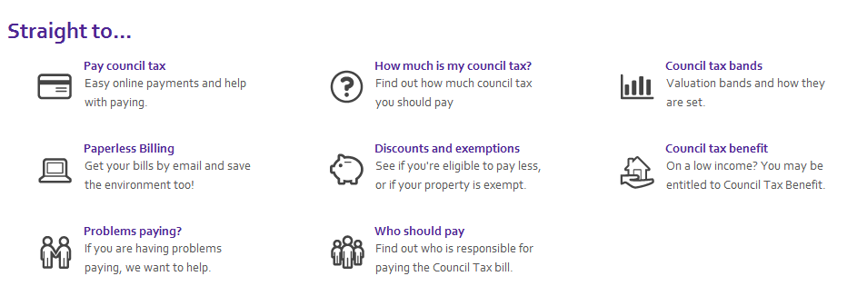
When we built liverpool.gov.uk we focused on the core premise that people come to the site to do one thing - then they leave. So we built a website with nice clear landing pages that provided clear signposts to the tasks people want to do. It’s simple and it works well (we think).
Mega Menus and top level navigation
We also built in segmented and mega-menu navigation - to help people “get around the site quickly”. Of course, if you go back to the first point, people only come to do one thing, then leave. So, why would they want to get around the site quickly?
[caption id=”attachment_288” align=”aligncenter” width=”686” caption=”Site menu and sections. The mega menus drop down.”]
Breadcrumbs
Then for good measure we added a breadcrumb, so people could get a sense of place on the page. It’s the “You are here!” element of the website.
[caption id=”attachment_290” align=”aligncenter” width=”265” caption=”Breadcrumb on the site.”]
Secondary navigation
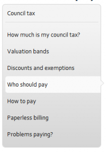
When people get to the page with the task on, we have secondary navigation. This is so people can move around the section of the site they are in. So when you’re looking at council tax bands, you can quickly get to discounts and exceptions, but on a large site, to keep the secondary nav small and focused, we only really show you the bit of the site you are in. It’s a bit like a breadcrumb trail…. oh, yeah.
Related Pages
When we think something that isn’t in the secondary navigation might be relevant we link to it in “Related pages”, usually in the content, and on the right. So, for example, when someone is looking at paying council tax, we give them links into the benefits section of the site.
the A-Z
The A-Z is a compromise. We knew before we started that it was hardly used on the old site, and it’s still hardly used on the new one, but the number of internal questions “What about the A-Z?” made us put it on the site for a quiet(er) life.
The theory, if one exists, is that it’s the catch all - “What about obscure service X?” - but really, if you get to that point, your site has failed.
[caption id=”attachment_289” align=”aligncenter” width=”532” caption=”An A-Z.”]
In this first post, I’ve set the scene of all the navigational aids that we put on our lean and clean website. In the second post, I’m going to ask, how much of any of this is actually being used, and what’s the value of keeping it all?
So, fast forward to Part 2 - Navigation, the stats.

